Graphic design for startups: What to build, in what order, and why it works


The short version
- A startup's brand identity is not a single logo. It is a system of logo variations, a color palette, a type pairing, and a short set of rules that keeps every asset looking like it came from the same company.
- Design attention tends to go toward the homepage hero section, while the comparison pages, pricing tables, and documentation that determine a buyer’s decision get whatever effort is left over. This allocation is backwards.
- Beyond the website and the logo, pitch decks, social content, packaging, and conference booths are graphic design surfaces too. Each one is a chance for a buyer or investor to form a judgment before reading a word.
- A documented, lean design system, even if one page long, keeps a small team consistent across every platform without needing a full design department.
- AI tools can speed up execution once a visual identity already exists, but letting them define that identity from scratch tends to produce something that looks like every other startup using the same tool.
Your startup’s first impression: Brand identity
A brand identity is a small set of interlocking decisions: a logo and its variations, a color palette, a typeface pairing, and a short document of guidelines that ties them together.
Logo:
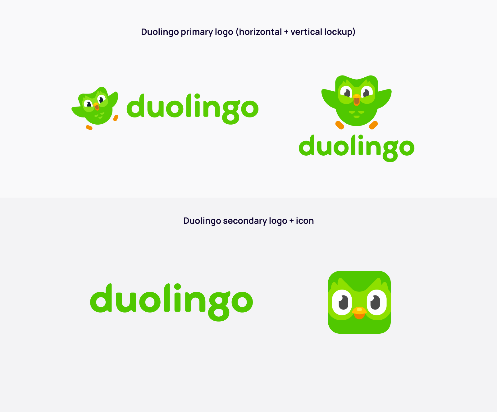
A single primary logo rarely covers every situation a startup runs into. Most identities need a few versions:
- A primary logo for the main touchpoints, the website and the deck
- A secondary or stacked version for tighter spaces like an email signature
- A simplified icon mark for places the full logo won't fit, a favicon or a social avatar
Brand guidelines:
Design decisions carry more weight than one would assume. A color palette needs enough contrast to stay readable for every visitor. A typeface pairing needs to be legally licensed for how a startup plans to use it, on the web, in a deck, and in print. Without a rulebook, all design decisions would be governed by instinct, and everyone’s instincts work differently.
This is where brand guidelines come into play. A one-page style guide covering the logo rules, color values, type choices, and a few layout principles is usually enough for a small team to stay consistent, and it can grow into something more detailed later.
Designing a stable and unique identity
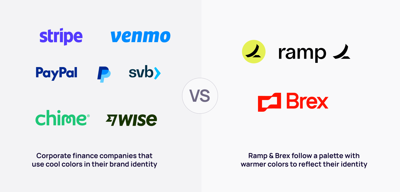
The harder decision sits underneath the visible choices: which trends to follow and which to leave behind. Every industry develops a default look. For example, fintech tends to lean on cool blues, greens, and purples. This does not mean that a fintech startup is required to use these colors. The question worth asking is whether a color or layout is being chosen because it currently looks like the rest of the category, or because it reflects what the company actually stands for.
Ramp is a useful example here. Corporate card and spend management is a category full of calm blues, but Ramp built its identity around black, white, and a sharp green, paired with an editorial, almost newsroom-style layout. The palette breaks the category default on purpose, and it is one of the reasons the brand reads as distinct rather than interchangeable with other finance tools.
Design quality is also a window into the business behind it. Misaligned grids, inconsistent spacing, and unclear type hierarchy register as carelessness. In categories like finance, accounting, or compliance, where trust is essential, that quality of design leads to a weak, unreliable first impression before the buyer or investor even reads a single sentence of copy.
Why decision-stage pages deserve more design than the homepage
A startup's website is really several jobs stacked on top of each other. The homepage does an awareness job, giving a new visitor a fast read on what the company does. The comparison page, the pricing page, and the documentation do a decision-stage job, helping someone already close to a choice work through the details.
Design effort tends to flow toward the first job and away from the second, since the homepage gets seen by more people. That allocation, though cultivating a good first impression, misses where the value actually sits. A visitor who leaves the homepage within seconds was never going to convert on the strength of the hero section alone. A visitor reading a comparison table or a pricing breakdown is at their decision stage, and a clear, well-organized version of these pages moves them more than another round of polish on the section most people scroll past.
The standard conversion checklist still applies underneath that priority call: easy navigation, a layout that works as well on a phone as it does on desktop, fast load times, and calls to action placed where someone is actually ready to act rather than wherever looks tidiest in the layout.
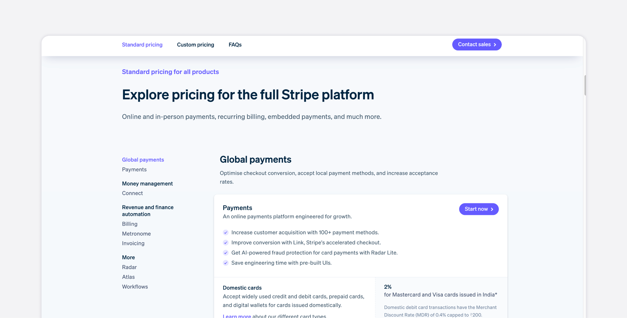
Stripe is often held up as the reference point for this kind of decision-stage design. Its documentation and pricing pages get the same design attention as its marketing site: clear tables, consistent code samples, and a visual hierarchy that makes dense technical detail easy to scan, which is exactly the material a visitor is reading right before they decide to integrate.
Designing a pitch deck that actually gets you funded
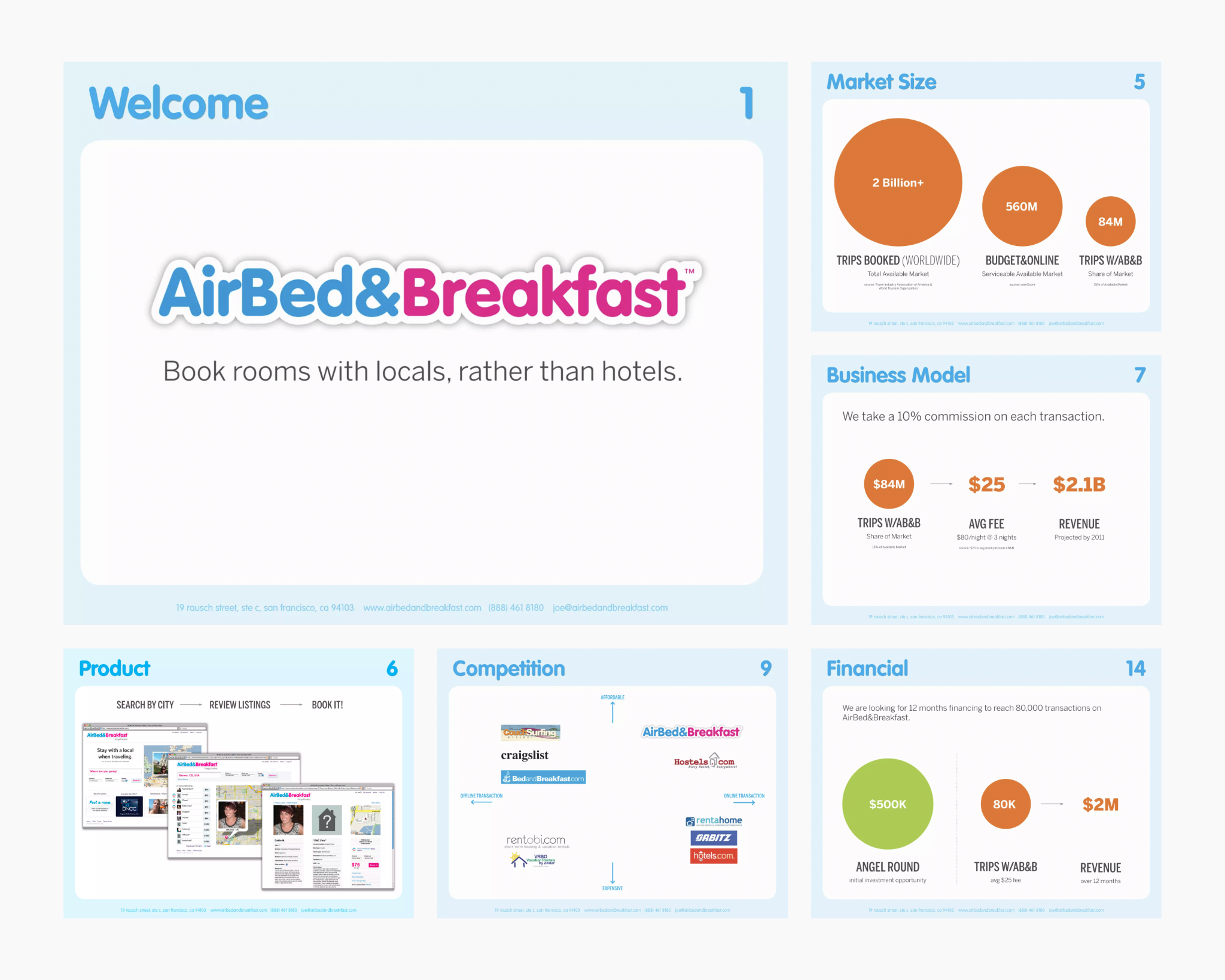
A pitch deck behaves a lot like the decision-stage pages on a website. An investor is not being introduced to the category for the first time. They are trying to work through a specific set of facts quickly enough to decide whether to keep listening. Clean slide structure, a clear narrative arc, and well-designed charts visualizing tested data do more work here than decorative slides, since the goal is comprehension under time pressure.
Data visualization sits inside this same job. Market size, traction, and financial summaries rarely persuade anyone as raw numbers in a table. Turned into a clear chart or a simple infographic, the same numbers become something an investor can grasp at a glance, which is helpful while pitching within a time constraint. The decision that matters most here is restraint: show the one number or trend that actually supports the point, not every metric available.
Airbnb's original seed deck (2008) still gets circulated as a model for this kind of restraint while putting together pitch decks. One idea per slide, simple charts, and no decoration standing between the investor and the point being made.
Why social media is the hardest place to stay consistent
Digital ads and social posts are the most-produced design assets a startup makes, and also the ones most likely to ignore the brand system entirely. Ad design has its own practical rules: a clear headline, a minimum-noise layout, and a design consistent with the rest of the brand that repeated exposure builds familiarity and trust.
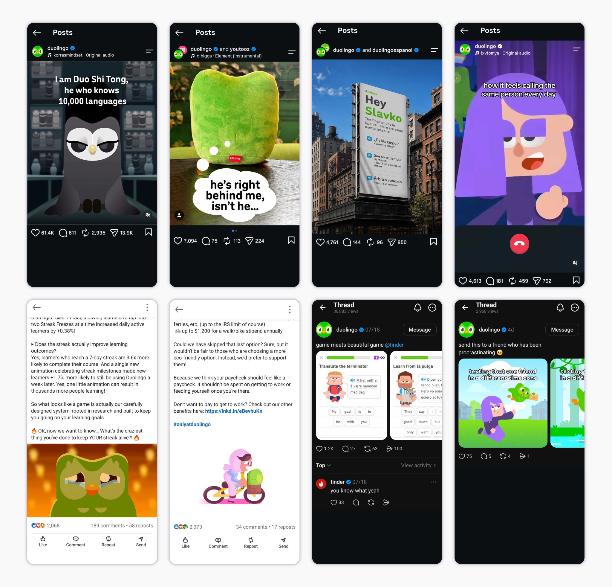
Social platforms are where this consistency either shows up or quietly disappears. A LinkedIn post, a Twitter thread graphic, and an Instagram story each feel small enough to treat as disposable, which is exactly why many startups default to whatever a scheduling tool suggests. Applying the same system there, a fixed set of templates for quote graphics, data visuals, and announcements, keeps a small startup's feed looking coordinated rather than improvised.
Duolingo is the clearest case of this working at scale. The same characters and irreverent visual voice show up identically in the app and across every social platform it posts on, to the point that a Duolingo post is recognizable before the logo is even visible.
When motion graphics and video are worth the investment
Motion graphics, explainer videos, product demos, and animated micro-interactions tend to matter most once the brand identity, website, and core marketing assets are already settled. Video compresses a complex idea into something watchable in under a minute, and performs well across platforms that favor it. It is worth investing in deliberately rather than early, since a polished animation cannot compensate for an identity that hasn't been defined yet.
Taking design off the screen: packaging, merchandise, and events
Graphic design for a startup does not stop at the logo and website. It extends into every part of your brand a person can experience: product packaging, merchandise, a conference booth, and the printed materials handed out there.
Online, every competitor is one click away and rendered at the same size on a screen, which flattens real differences between them. Events remove that flattening. A booth with a considered layout, printed materials that match the visual language a visitor has already seen online, and a team that looks like part of one coherent brand reads as more serious than a folding table with a banner and generic business cards. That impression lands harder in person, and it confirms whatever signal a buyer already picked up online.
The practical side is worth planning for early. Printed materials need the correct size, color format, and file specs for the printer being used, since a design that looks right on screen can shift in color or crop incorrectly once printed, and that is an expensive thing to catch after a few hundred copies.
Design is a system, not a set of assets
Every surface above holds together only if it ties back to the same source. A minimum viable system does not need to be elaborate: a short style guide covering the logo, palette, and type, plus a handful of reusable components that drop into a new asset without redesigning it from scratch each time, things like:
- Buttons and CTAs
- Icons and badges
- Background treatments and section dividers
Building that system pays off as recognition, and recognition compounds the way a body of useful content does. A visual pattern a buyer sees once in a blog post, again on a comparison page, again at a conference booth, and again in a social post, builds familiarity across each exposure instead of starting over every time. A consistent design language repeated across six months of blog posts, comparison pages, and community conversations tends to carry more weight than a striking new identity introduced every few months, because trust in a high-consideration category gets assembled slowly and publicly.
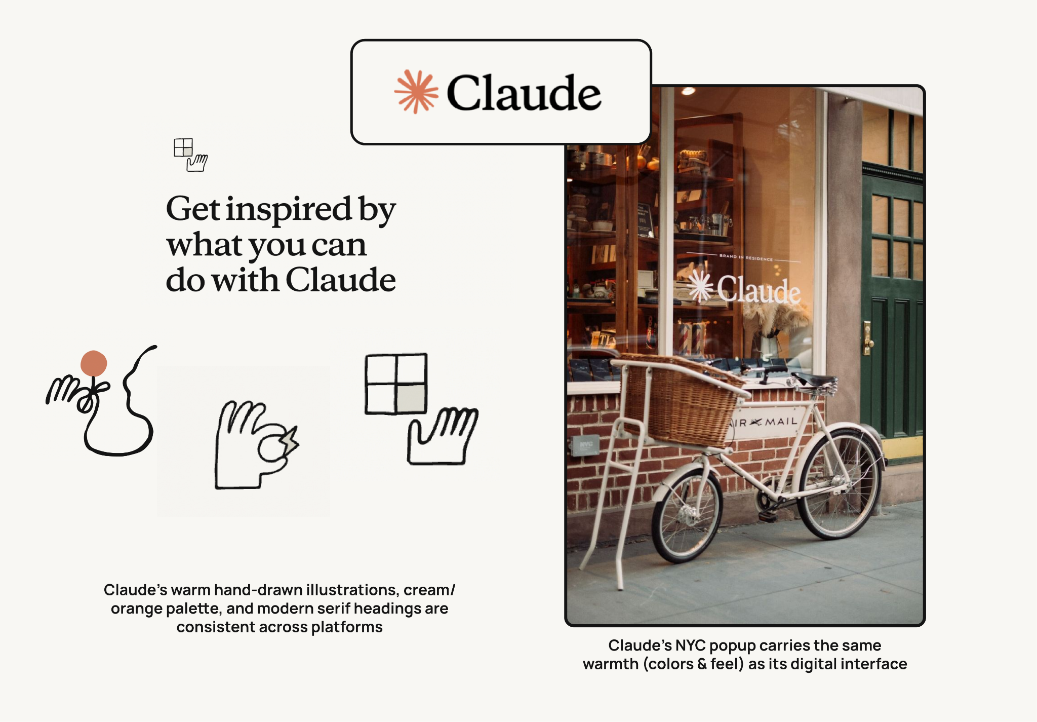
Anthropic's Claude is a good example of what this looks like fully carried through. Their warm, sketchy, hand-drawn illustration style and cream-and-orange palette show up on the product, the marketing site, the blog, and printed materials at conferences, stickers, booth signage, and swag. None of it feels like a separate campaign, because it is all drawn from the same documented system rather than reinvented for each surface.
Where AI fits, and where it gets in the way
AI design tools are useful for a small team without a dedicated designer, mainly because they remove the blank-page problem and speed up execution. The biggest issue, however, is that the same tools are available to every other startup in the industry, so the outputs tend to converge. A visitor's eye picks up on an AI-generated icon set or an AI-generated gradient instantly the same way it recognizes a stock photo. At the initial stage of a startup, AI design tools eliminate distinction, which is a risk they cannot afford to take.
The way around that is to map the competitive landscape before designing anything: which fonts, palettes, and layouts already dominate the category, so any departure from them is deliberate rather than accidental. Distinctiveness within a category is worth more than novelty for its own sake. Finance tends to read as trustworthy through precision, a developer product through technical fluency, a compliance platform through clarity above almost everything else. The goal is to look like the most credible option within the specific rules of the category, not like a design agency's experimental portfolio piece.
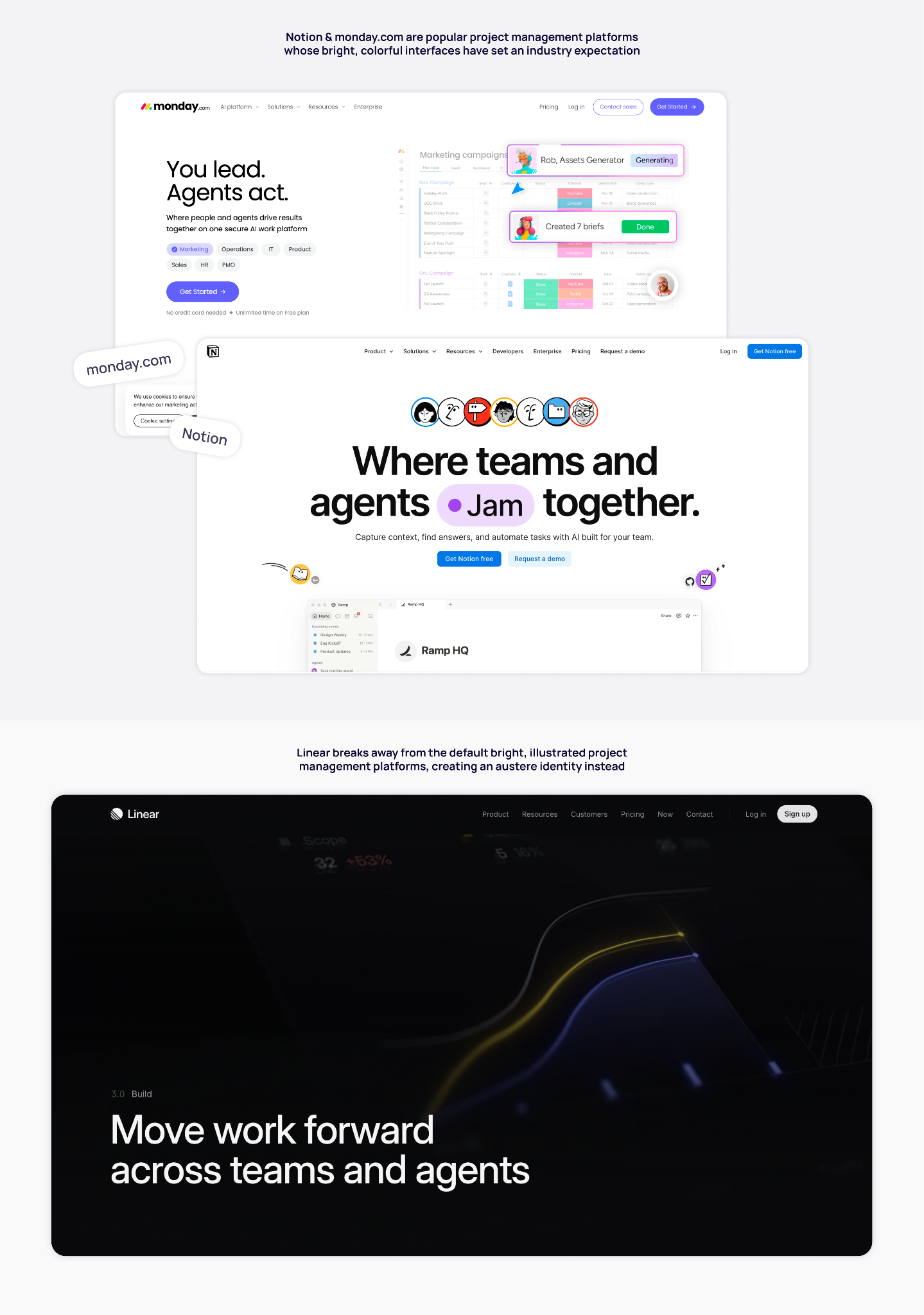
Linear is a good reference point for this kind of restraint. Project management tools tend to default to bright, illustrated websites, but Linear has built a dark, precise, almost austere identity. That choice was distinctive enough that other startups now describe their own sites as going for a "Linear look," which is a strong sign that Linear, the original, stood out rather than blending in.
There is a second AI consideration, unrelated to sameness. As more research happens through AI assistants that read a page and return a synthesized answer, visual clarity starts to matter for a different reason. Well-labeled diagrams, a clear typographic hierarchy, and structured tables are easier for both a human reader and an AI model to parse and represent accurately.
Once a brand system is in place, AI tools are a reasonable way to move faster inside it, generating variations of an already-approved template rather than defining what the template should be. But completely relying on these tools, even after your brand system is established, is a risky choice because continuous innovative design decisions are necessary for the quality and trust your brand conveys.
Building it on a lean team and a lean budget
None of the above requires hiring a full design team on day one. Free or low-cost tools cover most early needs, and a startup can move up to more capable software once the volume of work and the complexity of the brand justify it. Templates for social posts, pitch decks, and landing pages give a small team a consistent starting point instead of building every asset from a blank canvas.
A short brief before any design work starts (the goal, the audience, and the specific deliverable) saves more time than it costs, since most rework comes from a designer guessing at requirements that were never written down. Working with a freelancer, a small agency, or a part-time designer is a reasonable way to get a properly built identity system without carrying a full-time design hire before the company is ready for one.
Frequently asked questions
What design assets should a startup build first?
A simple identity system, a logo with its variations, a color palette, and a type pairing, along with a one-page style guide, covers the foundation. From there, prioritize whichever channel buyers actually encounter first, usually the website and a pitch deck if fundraising is active, before expanding into social templates and event materials.
What is the difference between a logo and a full brand identity system?
A logo is a single mark. A brand identity system is the complete set of rules around it, color, typography, layout, and a documented style guide, that keeps every asset a startup produces recognizable as coming from the same company, whether that asset is a website, a deck, or a conference banner.
Should a startup follow the design trends common in its industry?
Only where those trends genuinely reflect what the company stands for, not by default. Knowing what a category typically looks like is useful for identifying what to move away from on purpose. A departure from category norms grounded in an actual reason tends to read as more credible than a design that follows every convention out of caution.
How much should an early-stage startup budget for design?
Enough to cover a properly built identity system and a working website, since both function as ongoing trust signals rather than one-time expenses. Beyond that baseline, free or low-cost tools and templates can carry a lot of the day-to-day production, with a freelancer or part-time designer brought in for the foundational identity work that is harder to template.
Are AI design tools safe to rely on for a startup's core brand identity?
They are useful for producing variations once an identity system already exists, and risky as the sole source of that identity in the first place. Because the same tools are available across an entire category, relying on them for foundational decisions, the logo, the palette, the layout language, tends to produce something that reads as generic rather than distinctive.


.png)